Context
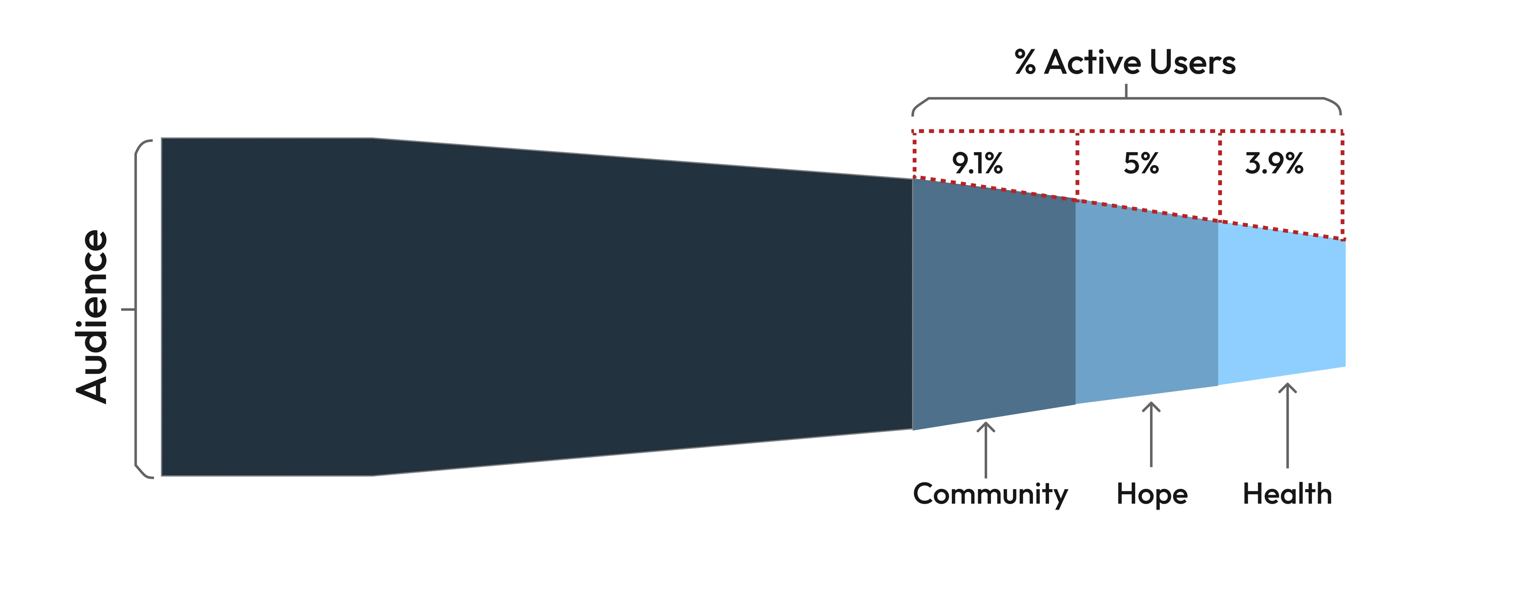
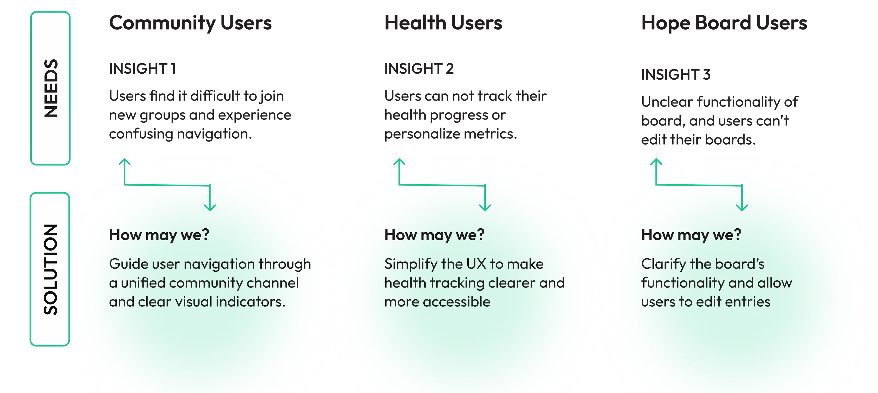
Usage data showed an 80% drop-off across the app, with low engagement on the Community, Health, and Hope features.
Before and After Designs
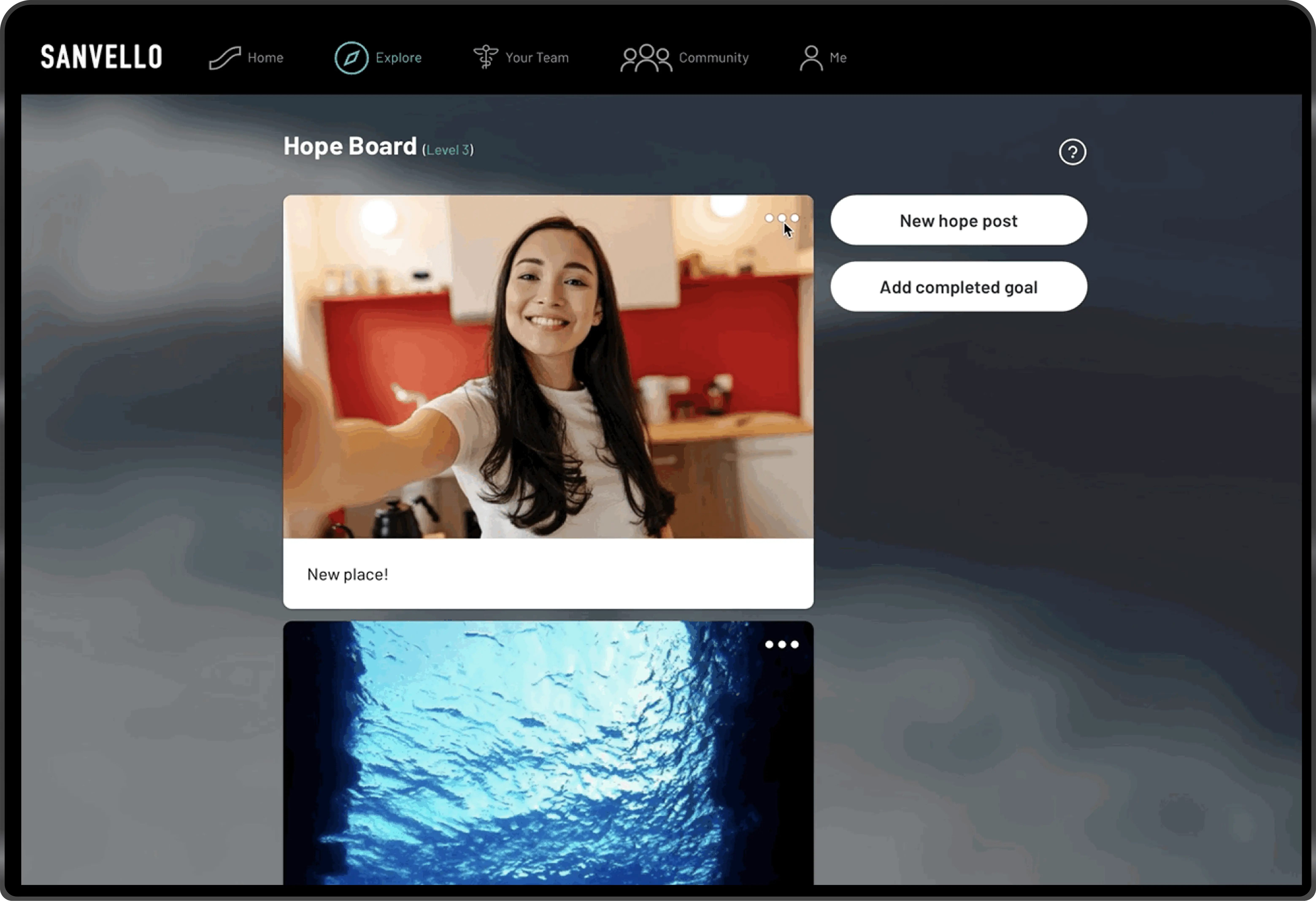
Hope Board — Before
There was confusion around functionality and usability challenges managing entries.
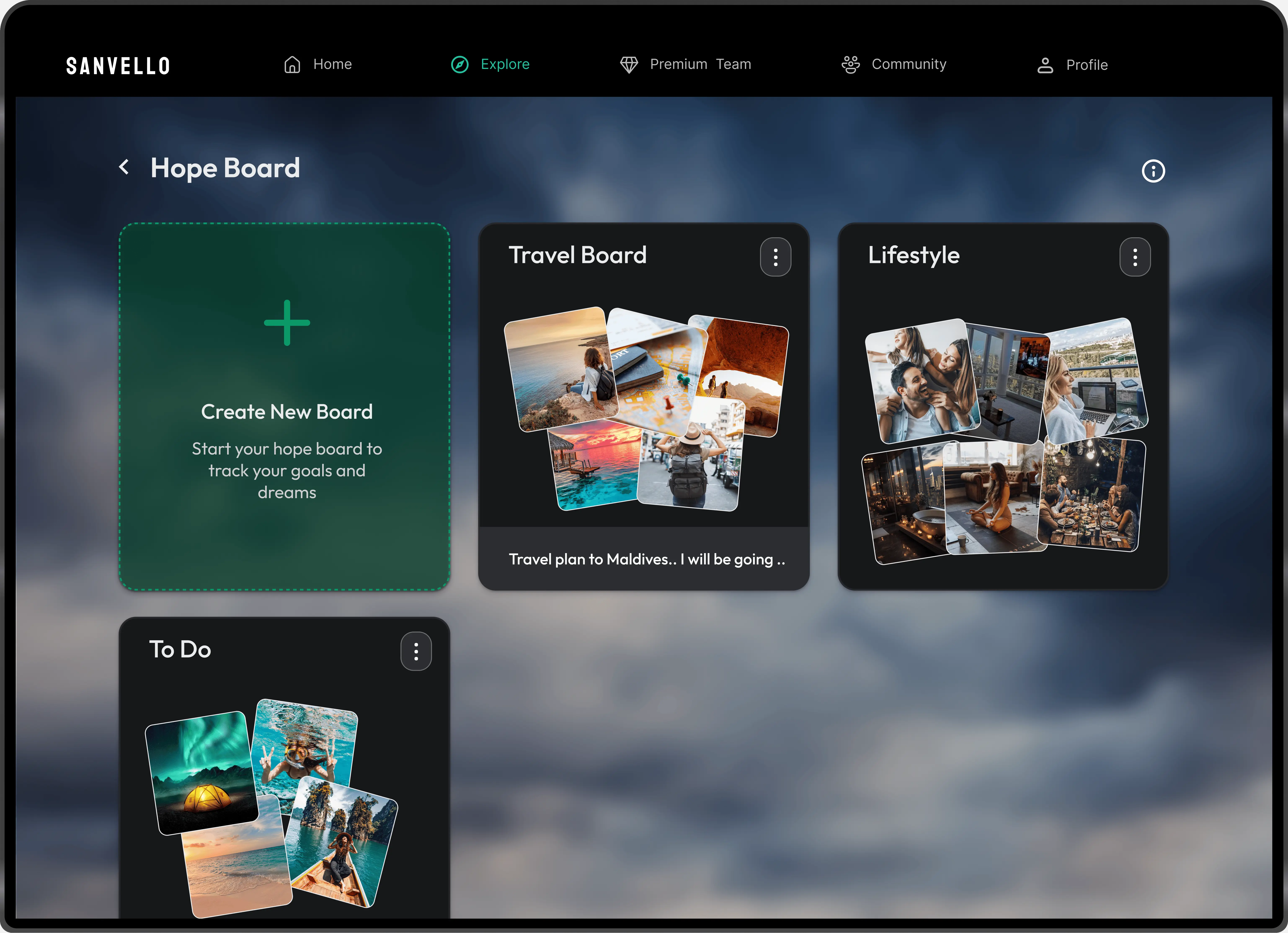
Hope Board — After
Intuitive experience, allowing users to easily create, edit, and personalize multiple entries, creating engagement.
Health — Before
Insufficient overview and personalization options, with a cumbersome UI requiring extensive scrolling.
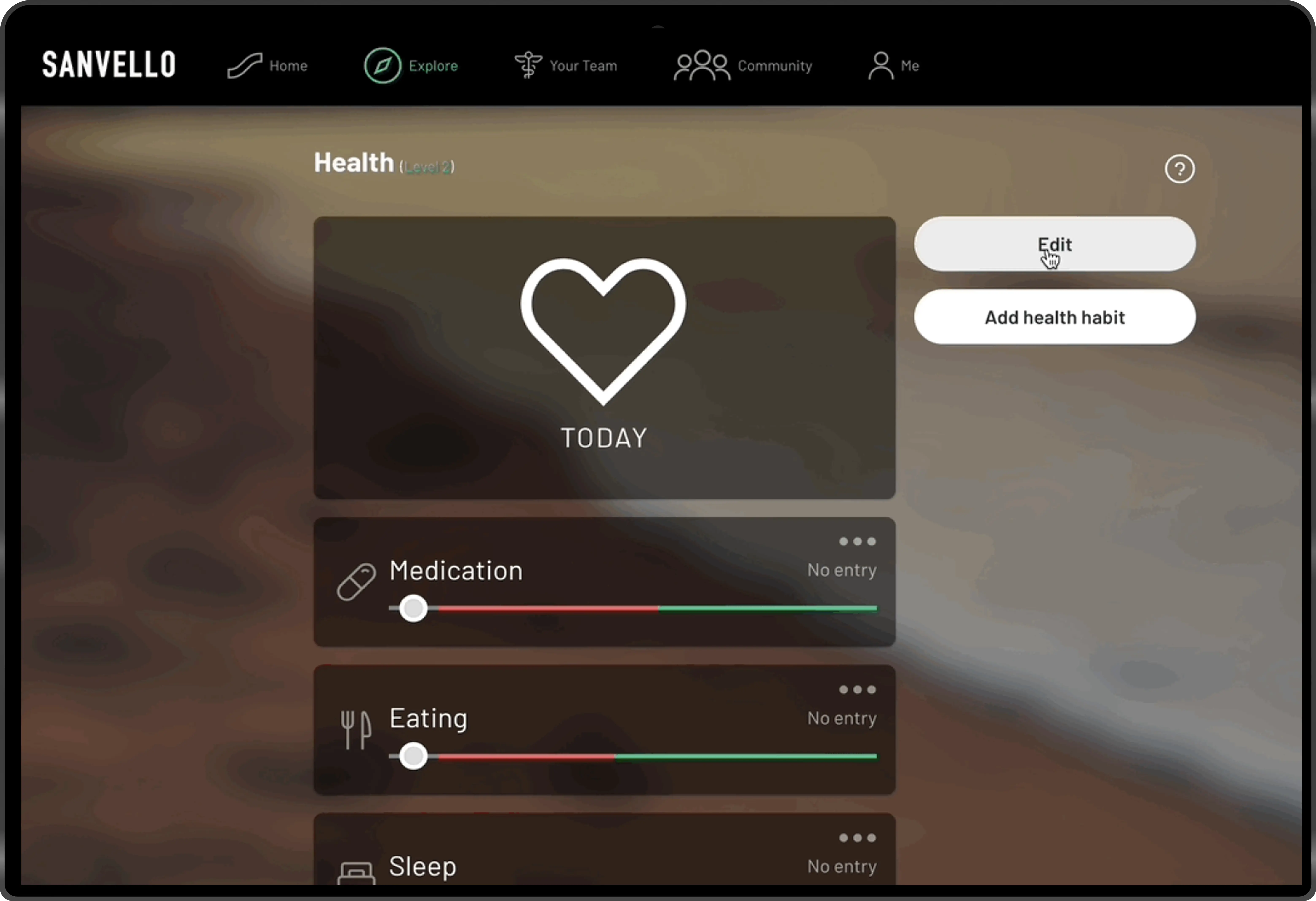
Health — After
Streamlined UI simplifies navigation and dashboard highlights users' health overview and patterns.
Community — Before
Redundant chat and discussion functions with inconsistent UI led to navigation challenges.
Community — After
Unified community feature with streamlined navigation, quick access to groups, and intuitive visual cues that guide users.
Approach
How might we identify the causes of low engagement and retention across features?
UX Evaluation
I conducted a UX heuristic evaluation of the three main features to identify usability issues, pain points, and opportunities for improvement.
Current problems
Define
Based on the insights, I identified core user needs across key features and framed them into questions that guided the design direction.
Key Decisions
Community — Streamlined Channel Structure
I merged discussions and group chat into a single, unified community page, replacing unclear flow with a clear entry point and intuitive visual indicators.
Community — Improved Access
Since access to the right groups was the most valuable touchpoint, I introduced a search bar that helps users find relevant communities faster.
Community — Content Bookmarking
I added an interactive save post feature that helps users keep track of posts they care about and easily revisit them.
Health — Simplified Tracking Overview
Health now provides a clear overview of all tracked metrics, with streamlined navigation and customization options.
Health — Focused Metrics Interaction
I added a filtering feature that lets users monitor the specific metrics they care about, allowing them make informed decisions.
Hope Board — Function & Engagement
I redesigned the feature layout to create a more intuitive flow and enable customization.
Hope Board — Enhanced Content Interaction
I introduced a note feature to deepen interaction, allowing users to add descriptive notes and get more personal value.
Final Demo
Result
Experience Impact
Business Impact
Reflection

Iterations & Ideation
Creating multiple iterations drove the ideation phase and enabled me to quickly discover the best pathways to retain users and create value.

Team collaboration
I collaborated with a UX designer, working in parallel on prototypes and iterations to redesign Sanvello.
Next steps
Our next step is to extend the redesign across features, establish consistency, and continue user testing to improve the experience.